
Home / Guide 03 / Brand Guidelines
Brand guidelines: the rulebook
Recognition is built by repetition, and repetition only happens when everyone applies the identity the same way. Guidelines are how a brand survives contact with new hires, agencies, partners and its own future.
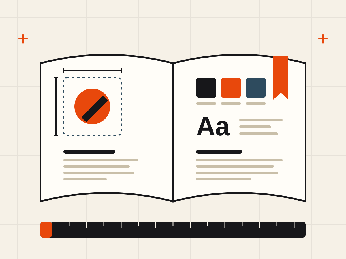
Why the document exists
A brand is applied by people who were not in the room when it was designed: the new marketing hire, the freelance developer, the partner co-branding an event. Without written rules, each of them makes a hundred small guesses — a stretched logo here, an off-palette blue there — and recognition erodes one compromise at a time. Guidelines turn identity from a set of files into a system that can be handed over.
The core contents
| Chapter | What it specifies |
|---|---|
| Foundations | Positioning, audience and personality in one page — the “why” behind every rule that follows |
| Logo | All approved versions (horizontal, stacked, mark-only), clear space measured in a unit of the logo itself, minimum sizes for print and screen, and approved background colors |
| Color | Every palette color with HEX/RGB for screen, CMYK for print, Pantone for spot jobs — plus allowed combinations and contrast pairs |
| Typography | Families, weights, the numeric hierarchy (heading/body/caption sizes), and fallback fonts for systems where the brand font is unavailable |
| Imagery & icons | Photography style, illustration treatment, icon stroke and grid — with examples of what fits and what does not |
| Voice | The personality traits with boundaries, grammar preferences, words the brand uses and avoids, and before/after rewrites of real copy |
| Applications | Ready templates for the highest-volume outputs: presentations, social posts, email signatures, business documents |
| Misuse | A page of explicit “never do this” examples — stretched, recolored, re-typeset or drop-shadowed logos |
The misuse page is not optional
The single most-read page of any brand book is the misuse gallery, because it answers the question people actually have: is this allowed? Show the logo stretched, rotated, recolored off-palette, set on a clashing background and decorated with effects — each crossed out. Boundaries shown visually are enforced far better than boundaries described in prose.
How much documentation is enough
Scale the book to the number of people who apply the brand:
- Solo founder or tiny team: a one-page cheat sheet — logo files, two colors with values, two fonts, three voice bullets. Anything more will not be read.
- Growing company: 15–30 pages covering the core chapters above, plus the templates that get used weekly.
- Multi-team or multi-market organization: a full brand portal with downloadable assets, because policing files by email fails at scale.
A short book that is read beats a long book that is admired. Every rule should answer a question someone has actually asked.
Ownership and upkeep
Guidelines rot unless someone owns them. Assign a named owner, version the document, and review it on a fixed schedule — once or twice a year is enough for most companies. Real questions from the field (“can the logo sit on photography?”, “which font in the mobile app?”) should be answered once, then folded into the next revision so they are never answered twice.
The handover test. Give the guidelines and the asset folder to someone who has never worked on the brand. If they can produce a correct social post, slide and email signature without asking a question, the book is done.